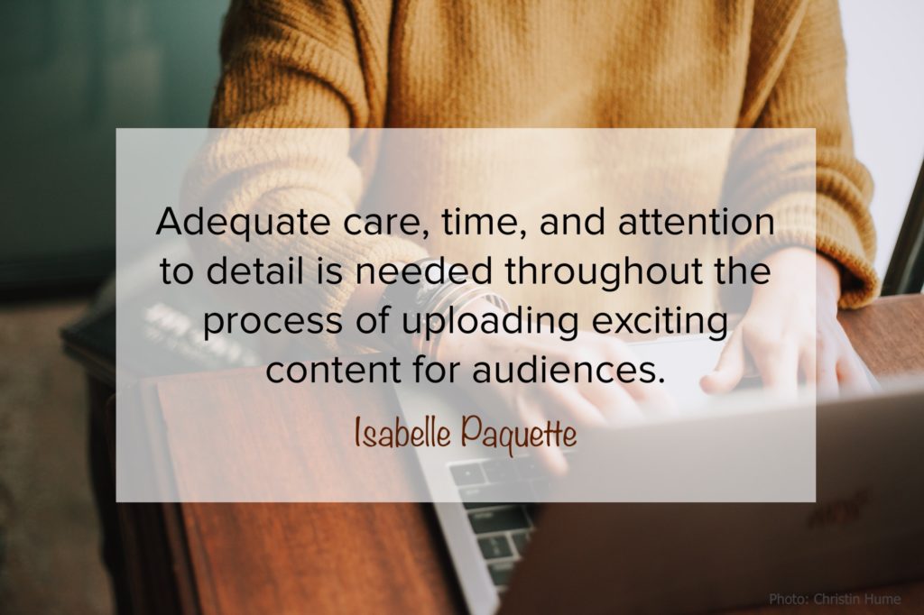
by Isabelle Paquette—My typical routine as IOM’s Social Media Marketing Assistant can best be described as dynamic. Whether I’m creating promotional graphics for an upcoming book release, lining up future evergreen content, or implementing a new blog initiative, each assignment is unique in representing our brand. Adequate care, time, and attention to detail is needed throughout the process of uploading exciting content for audiences.
To follow is a sneak peek behind the scenes of IOM’s process in creating graphics–including all the mistakes and tweaks that constitute a finished product we’re proud of.
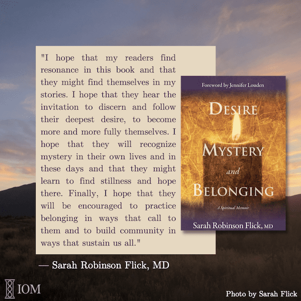
Let’s take a look at a promotional assignment I was tasked to create for Sarah Flick’s recent release, Desire, Mystery, and Belonging. IOM has the pleasure of highlighting new authors throughout a given month before their upcoming release. In this way, we’re introducing a new member of our community while also fostering a connection between author, publisher, and reader. The process begins like this:
Step 1 — A month prior to the feature month, I am provided with a list of predetermined graphics to be created. Some of these include:
- a title graphic with the author’s headshot,
- a tip from the author that coincides with our #tiptuesday
- a workplace photo, quotes from the author
- mockups of the book cover.
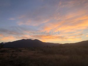
Sometimes, background images and information are provided for me to use as a “base” for my design. For example, I was given a quote from Sarah discussing her book along with this image she took. Other times, I source images directly from Canva for my assignments, use Canva templates, or completely start from scratch. *Canva is a free graphic design platform with countless templates and images available for use.
Step 2 — To create my design without the image, my first draft of the quote with the book cover looked like this:

As standard practice, IOM always places its brand logo in either the lower right or left corner of our content, unless it’s meant for talent to use externally. My goals in creating this graphic were: Readability, Appeal, and Clarity.
I then uploaded the background image and placed it on an Instagram-sized template to begin using my creative license, as follows:
- Readability: The text needed to be legible. Because the background is busy, I needed to find a way to make sure Sarah’s quote remained visible. By creating a solid box filled with a lighter color, I was able to place the quote in a darker color for added definition. IOM has two different colors for its logo, so I chose the color that would read better on the bottom half of the graphic, in this case, white. This was the same for Sarah Flick’s name at the bottom of the quote.
- Aesthetic Appeal: Color scheme, font, and other choices were influenced by the book cover design and background image. I knew I had to include the book cover to show what the quote is highlighting, so I chose to overlay it on my text box. By creating just enough space where they don’t overlap, the two elements combined to provide a polished composition in the center of the frame. Additionally, both contrast against the colors of the background image.
- Clarity: The reader must be able to understand the context of the graphic: a) that it is a quote, b) that the source is Sarah Flick, and c) that it is about the book. I didn’t want the graphic to be too busy, so I kept all three of these elements simple by not adding too much to them, just some light definition on the book cover for a three-dimensional effect. I also used traditional quotation marks, however other quotation graphics lend themselves to more stylistic endeavors, as in my example above with the plain background.
Step 3 — After submitting my preliminary design, the process goes into editing, which can take several more rounds to finalize the product. Usually, edits are received on an email chain, with everyone able to see opinions and edits as they come. Suggestions come in the form of bullet points, questions, and often marked-up copies of the graphic itself pointing to required changes. Anything can be changed from the previously mentioned goals. In this example, I needed to:
- Include a photo credit to Sarah for the background image
- Replace the cover design with a new version
Here is the completed graphic we used to promote Sarah Flick’s book: